This article is written by Mark Monfort, Head of Data Analytics and Technology.
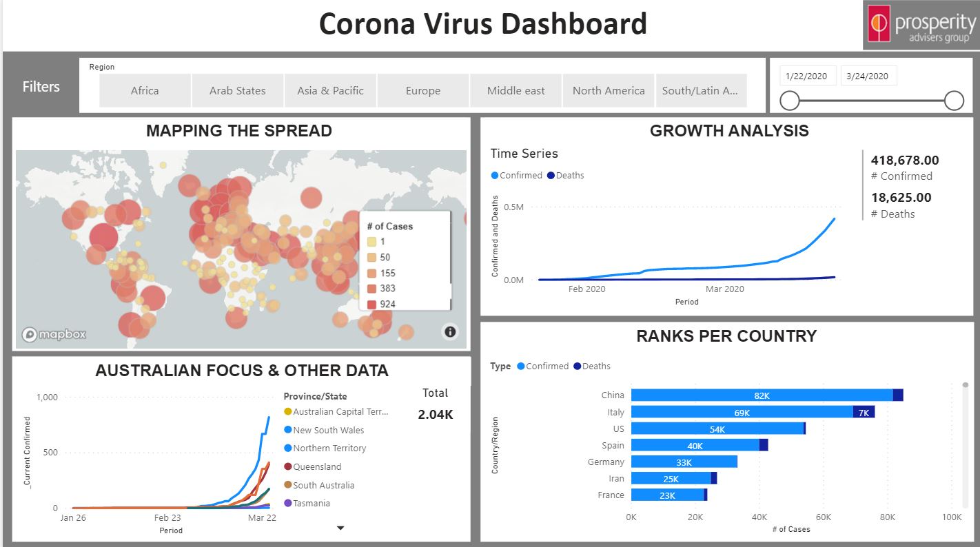
With coronavirus (COVID-19) still spreading, I thought I’d create a dashboard for anyone to use if they want to track its growth. It is based on data that John Hopkins University releases in the US where they transcribe information from PDF’s and publish the datasets on GitHub. This is updated at around 1-2pm AEST so this app is scheduled to refresh every day at 2:30pm and since I'm using the free Power BI service to share this with everyone (and it updates its public links hourly), you'll get this at 3:00pm.
UPDATED SOURCE/APP (as of 24 March 2020)
Hi everyone, a couple of things to update this evening on the data source and the application for the corona virus tracker.
Data
Earlier this morning I posted that the source data that my tracking app (and many others) relies on announced they would make changes. The details of this are here
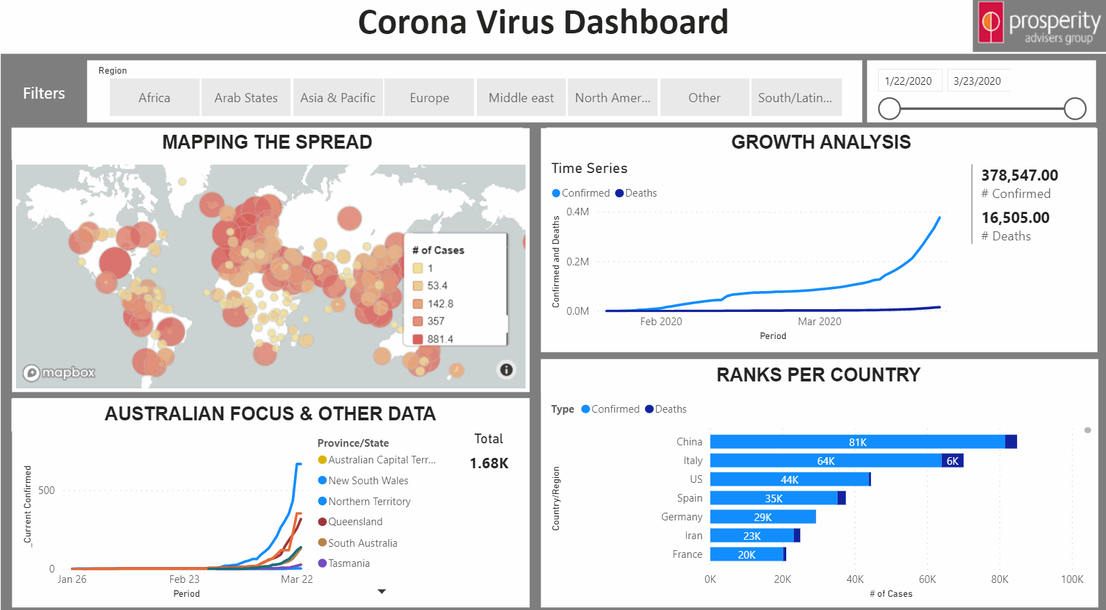
In summary, they've removed the tracking of recovered cases and will replace it with testing numbers. These will be very important going forward as more countries are feeling the pinch.
As of right now though, the latest figures in the old app have stopped and Johns Hopkins only published new data for Confirmed cases and Deaths.
App
The app is available HERE.
Perhaps fortuitous was this timing from JHU as it coincides with a new app I had developed since getting so much press about this in the last few days.
The coverage is great for business as people get to see what it is we're bringing to the market (analytics, app development, online dashboards etc), but more importantly, there is a duty to deliver insights in an interactive way that some other applications don't provide.
It's one thing to see the figures and read explanations, it's another to be able to interact with and explore the data and create your own charts.
Additionally, the old app did not follow the principles of dashboard design I prefer to use when building applications for other purposes. The first thing that the user should land on is a summary page which show some statistics and graphs/charts which give some (but not every) insight into the data.
The user can have some ability to filter at the top level and then also has more options to filter when they dive deeper into the app.
This area has similar features to what users had seen before, however, we have had to remove active cases and some forecasting data on deaths. The reason is that both of these relied on having data to do with recoveries which we'll no longer have. When the new data for testing numbers is made available, I will bring that into the equation here.
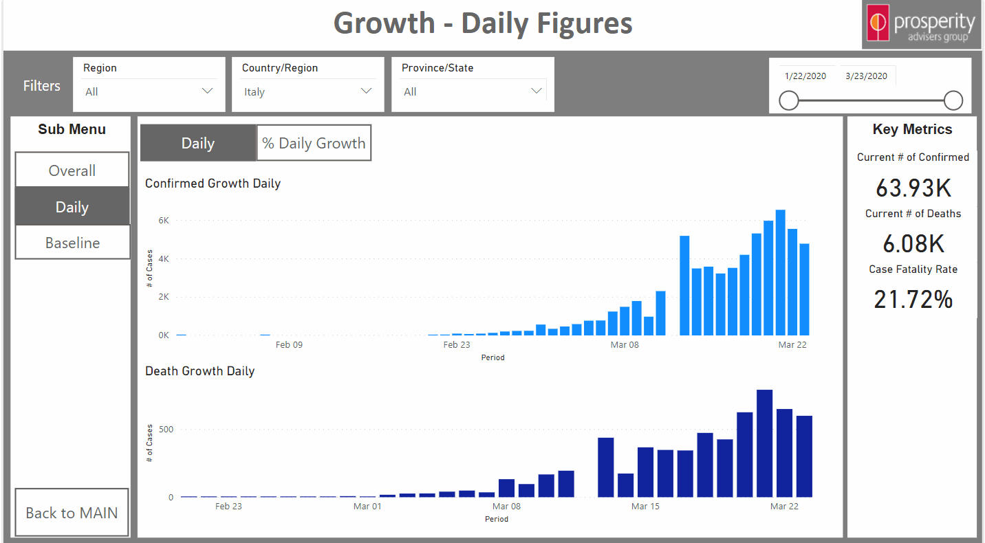
The Daily section allows users to see what Daily growth looks like and also see what the day over day growth is as a percentage.
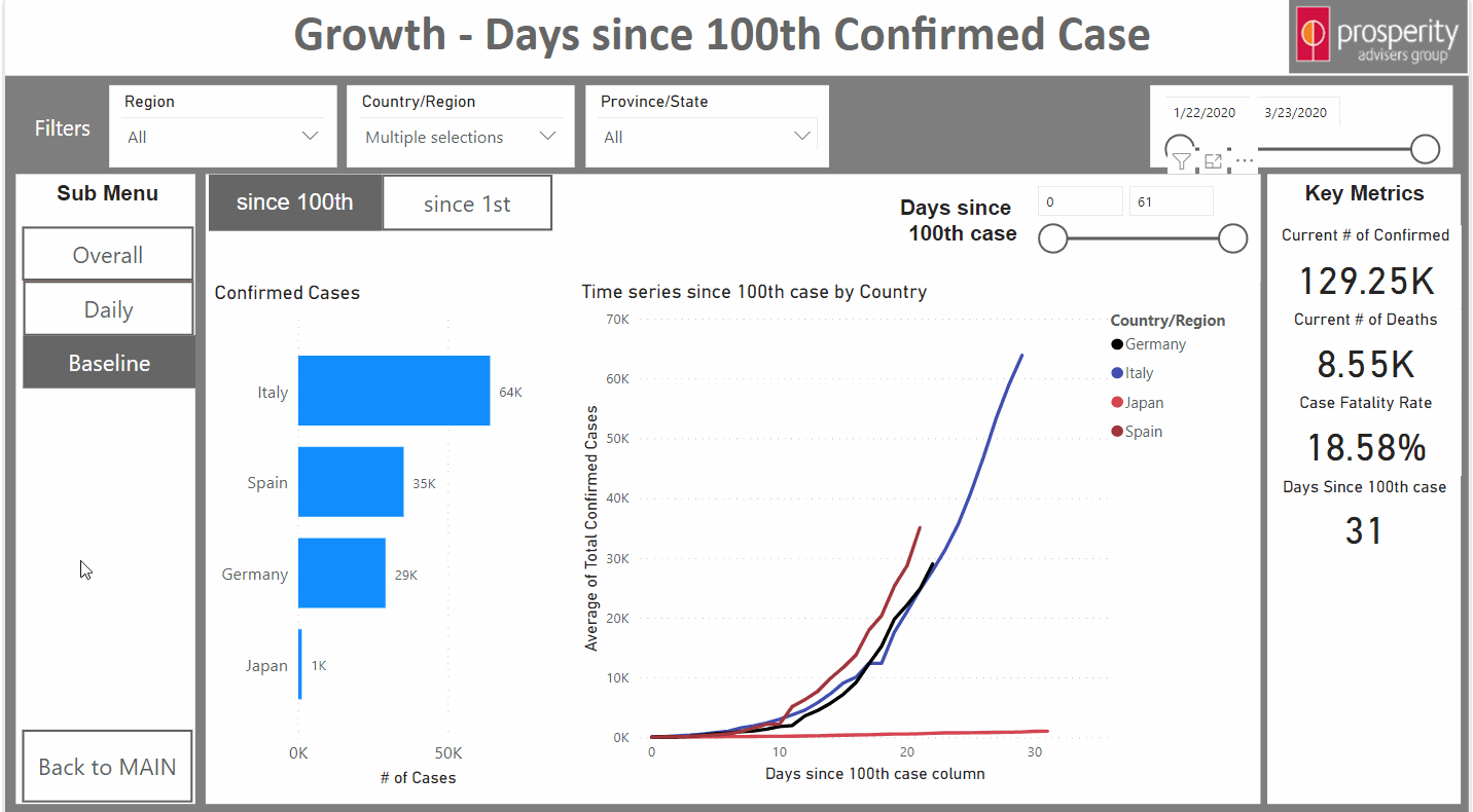
The Baseline menu is where users can baseline each country to the same start date. This stemmed from a few articles which showcase countries baselined to when they hit their 100th confirmed case. User can select different countries and see how they compare and progress over that time period.
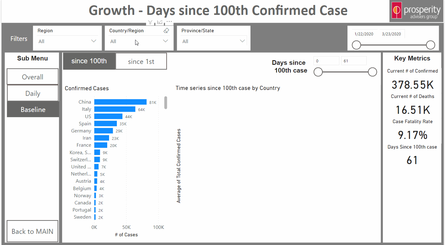
We can also do that for a group of countries since the first confirmed case.
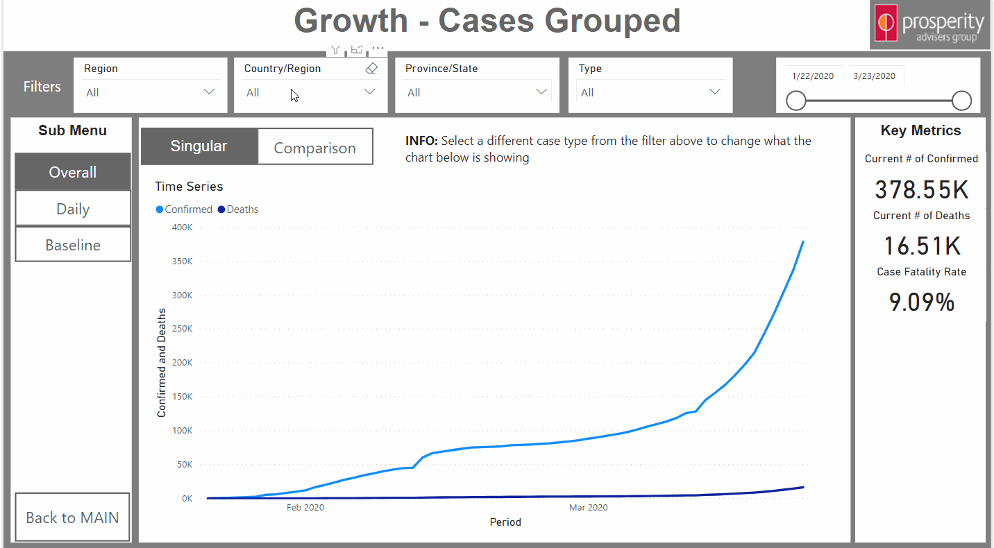
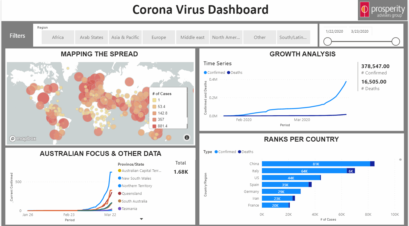
Growth Analysis
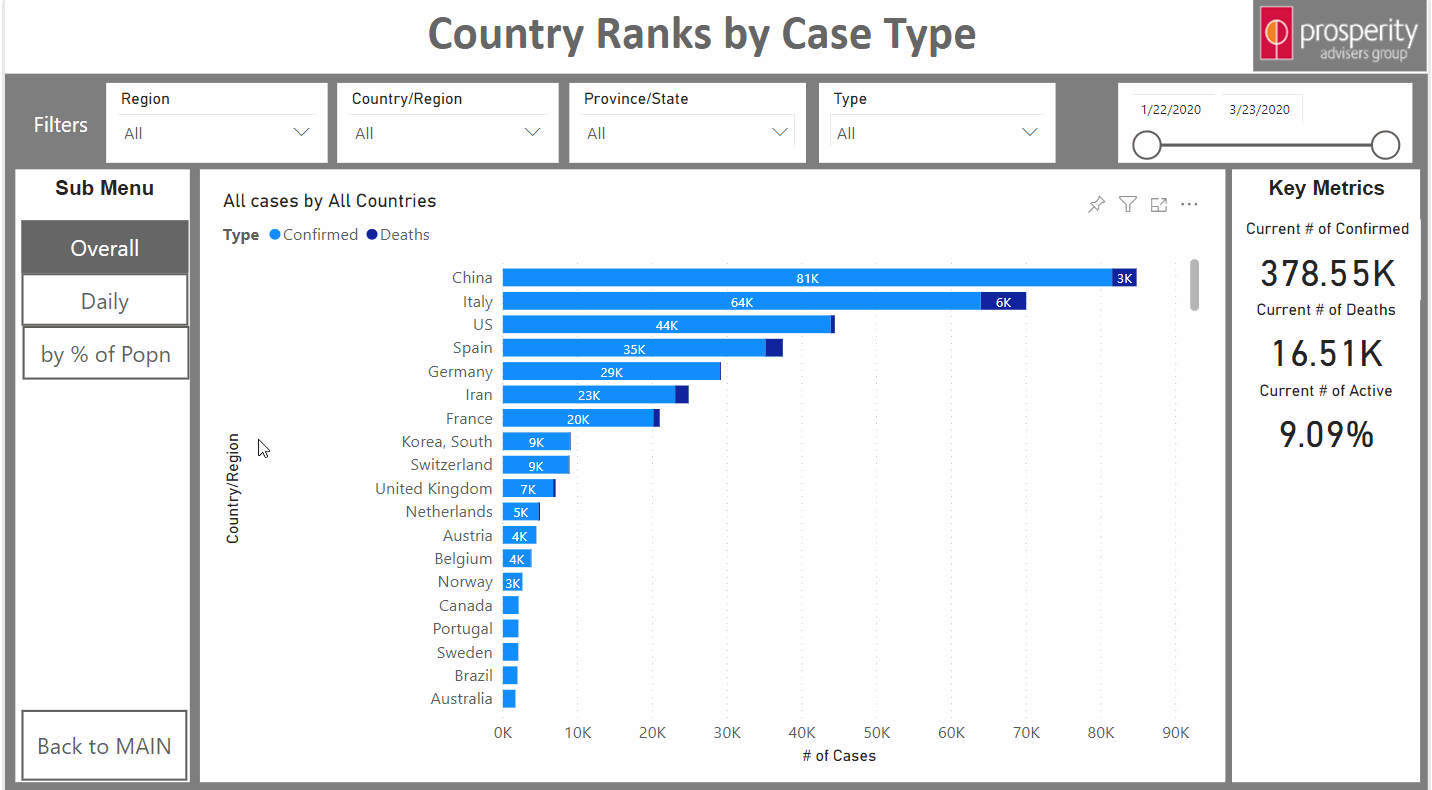
For now, users can navigate to the Growth page and look at cumulative growth at a single country level or they can do it from a comparison level across different countries and for different types of cases.
Doing it this way means that you can interactively track how progression moves and whether a country is flattening the curve or not.
Growth
The daily tab looks at Confirmed cases and Deaths as they occur daily
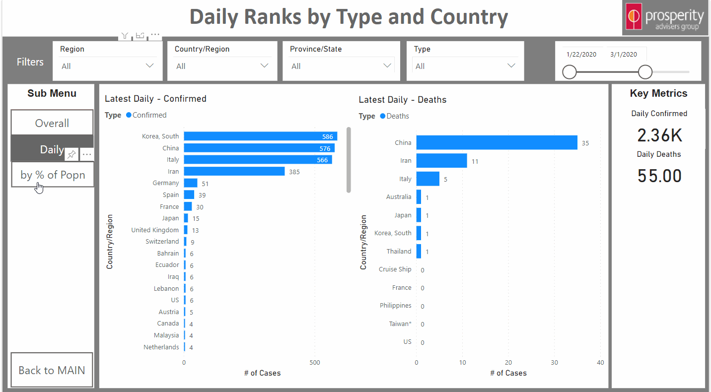
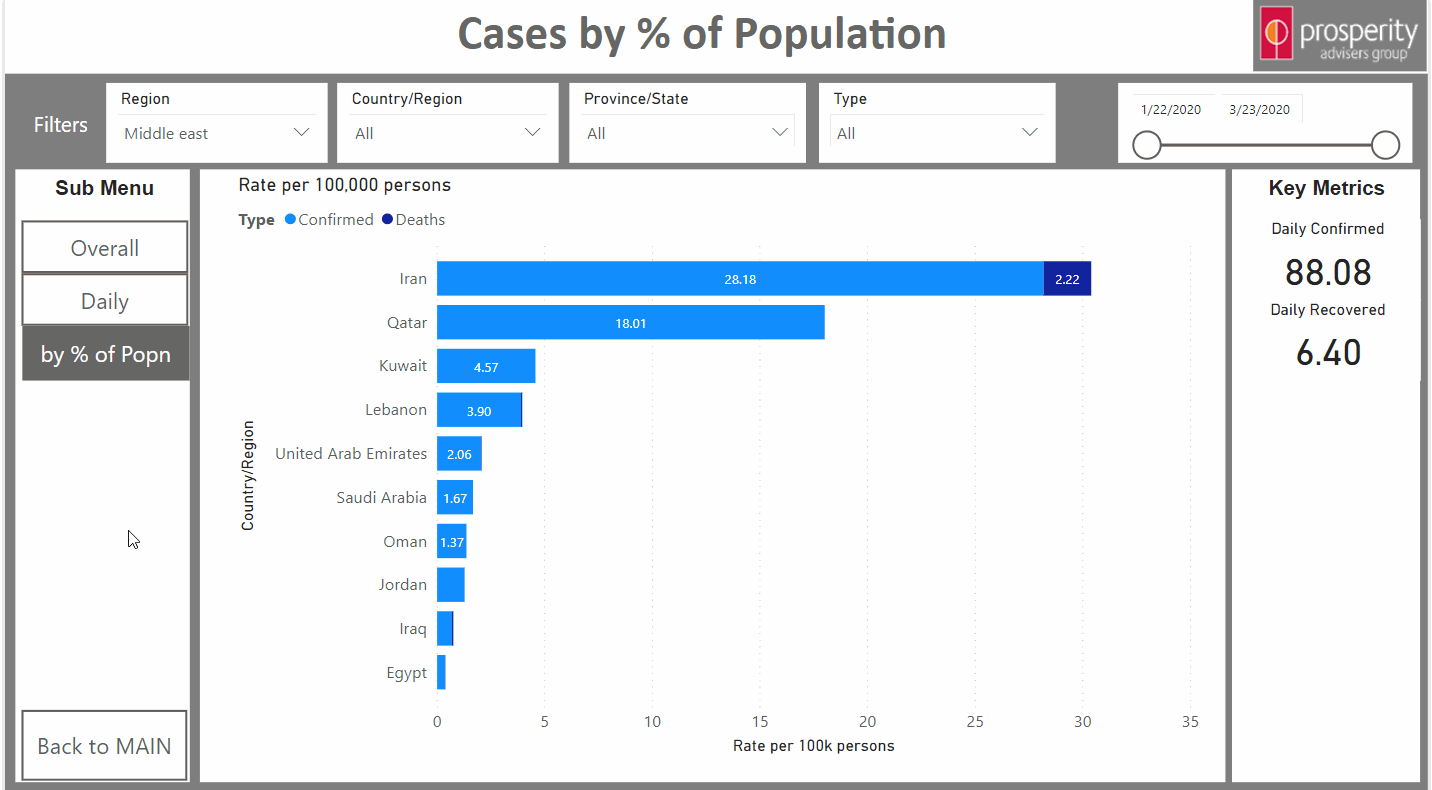
The by % of Population menu allows users to view the data for different countries as based on a per 100,000 persons in each country basis. Users can hover over each bar to see how that rate has progressed over time too.
Australia Focus
Links
If you want to access the dashboard click here.
The Application
Those wanting to embed the app in their own sites can do this by using this link iFrame code (feel free to change the size according to your needs).
Code: iframe width="800" height="600" src="https://app.powerbi.com/view?r=eyJrIjoiMWIyNjAxYjktYzg0MS00ODU3LWJkMWYtYjQyNjU5NjljMTI1IiwidCI6ImM4ODdmZGYyLWIwYTYtNDFlMy04ZmE4LTdmMjFkMDYyZGE4NSJ9" frameborder="0" allowfullscreen="true"
For anyone interested in how this app was built or wants to discuss how to get more out of their data then feel free to contact Mark Monfort on 02 8262 8700, or the team at Prosperity Advisers. Also, feel free to share this with others and please make sure to wash your hands!
Other Apps
There are a number of other applications that have created similar (and even better) ways of analysing this virus. The ones I know of are listed below.